As we kick off the year 2020, we decided to look back at 2019 and curate a list of the 10 best YMCA websites.
We all know a good website when we see one, we just might not know exactly why. We will be laying out the FACTS of what (we think) makes an appealing YMCA website.
Functionality; The ease with which the user can navigate the site.
Accessibility; The practice of making the site usable by as many people as possible.
Content; The allure and relevancy of the information on the site.
Treatment; The design and visual impact of the website layout.
Storytelling; The overall narrative, message and impression the site presents.
What does this mean? This means you won't get on the list just by the visual looks of your website. Sometimes a website might look great, but still perform poorly in other areas, like functionality and accessibility. If you can't access what you need, it doesn't matter how good the site looks - it is not serving its purpose.
Without further ado, in no particular order, the 10 Best YMCA Websites of 2019:
Sky Family YMCA

Why its on the list:
A strong aspirational message is on top of a background video that really shows off what the Y is about! There are bold CTAs (Calls to action) with colorful photos that make it obvious to the user on what is required to get more involved with the YMCA. Another feature to note is the use of an ADA widget in the lower left corner. On the fly a user on the site can change the contrast, text size and some other options to make it easier to read for the individual.
YMCA of Greater Indianapolis

Why its on the list:
A clean and subtle main navigation has simple but thorough pulldowns with access to greater information. The large blocks of color assist with keeping content separated and clear for the reader to define. The homepage content covers the basics, while leaving the visitors eager to learn more about this Y by digging deeper into the site. The direct links to social media work well for mobile access. The news and blog posts lead to inspirational stories to engage potential members.
Raritan Bay Area YMCA

Why its on the list:
For the on-the-go user, key points are the immediate email sign up via mobile, including a reassuring privacy terms widget. The ‘sticky’ main navigation is always conveniently there, regardless of which page is open. Rich content like important census information is a prominent link, lending credibility to this Y. Mobile friendly images and content are displayed in a color coordinated design, with the CTAs as a bright pop to catch your eye.
YMCA of the Rockies

Why its on the list:
There is a huge amount of information packed onto this homepage, but the navigation is simple when using the pulldown menus and extensive links. This site provides an accessibility mode for a higher level ADA compliance. Content includes a massive list of activities and a timely seasonal planning guide, as well as testimonial videos and an interactive map. Enticing imagery of the location encourages the visitor to take advantage of the expanded YMCA offerings, including vacation packages and lodging.
Metropolitan YMCA of the Oranges

Why its on the list:
This ySite has very clear navigation for the user, with large and bright CTAs. Notice the language selection option, and the high contrast and accessibility features available on the footer, providing an extra level of ADA compliance. On the home page you’ll find visually impressive feature tiles that allow members to navigate the site, using great YMCA photography with animation. This site also expands their content with inclusion of yStories, relevant and interesting blog entries to entice new members.
YMCA of South Florida
https://ymcasouthflorida.org/downtownmiamiy/
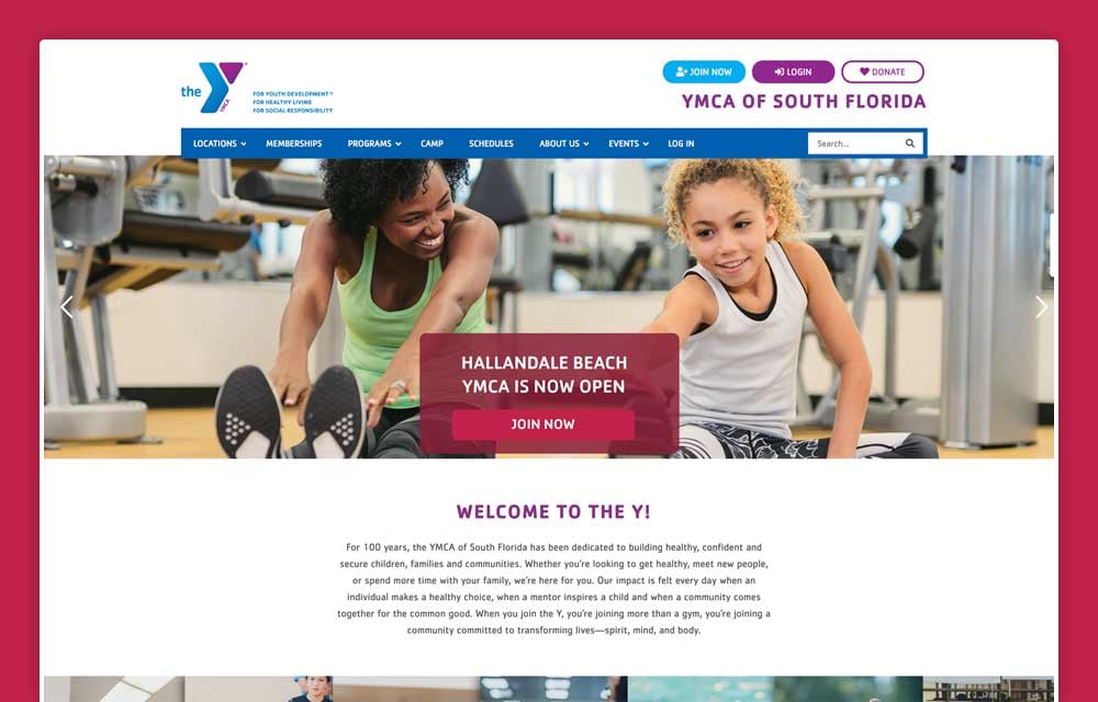
Why its on the list:
We can see immediately that this is not your typical YMCA website. It has a long homepage containing lots of information, with clean navigation and creative verbiage. The pleasing, simple graphics combined with blocks of copy gives this site a sleek modern look. Content boasts comprehensive and up to date blog entries to keep the potential or existing member engaged. This Y makes a point to highlight special needs inclusion programs, and their concept of achieving greatness in all areas of their member’s lives.
YMCA of Rapid City

Why its on the list:
This navigation menu stays on every page for easy access. Our attention is immediately caught by the movement of the video presentation on the homepage giving you a great overview and feeling of what this Y has to offer. This ySite utilizes the Silent Salesman feature, AKA a collapsible pop-up tab that stays on the bottom-right corner of every page, to advertise special events and promotions. Interesting content includes a comprehensive staff and board member directory for existing and prospective members to get to know those in charge. Other unique points that take this YMCA up a notch is the availability for purchasing staff apparel, a job listing page, and a cafe on premises.
Camp Jewell YMCA

Why its on the list:
Right away you are pulled into the camp experience with a great background video on the homepage. This engaging site utilizes chat window and messenger login capabilities instantly. The straight forward navigation stays with the user via floating text and a scroll window. Vivid colors and many action photos keep up the appeal. Easily see upcoming events and the latest blog articles from the homepage. A worthy highlight is their online store and shopping cart for local camp merchandise.
Fairview Lake YMCA Camps
https://www.fairviewlakeymca.org/

Why its on the list:
Perhaps even more than the previous example, the homepage video pulls you into camp. Do I even need to scroll further? Where can I sign up? The main navigation has every option to link the user to any information needed. Use of the countdown timer keeps promotions front and center. They have the ability to control full pages of content to help campers/parents find all of the information they might need. High contrast and accessibility options for extra high ADA compliance is available on the footer. Fantastic images combined with video and bright color blocks makes for an exciting homepage. Visitors can get a good feel for this camp by viewing the virtual tour. This particular Y offers environmental education for children and adults.
YMCA of Rome & Floyd County

The sticky homepage navigation reduces the header to create more room for content as the user scrolls down. This Y utilizes a slideshow to showcase different programs & members with CTAs to learn more about each. They also found a way to incorporate their sponsors via a carousel of logos towards the bottom of the page. The Silent Salesman is at the ready to entice potential members with a free trial. Apps are available to keep the mobile user connected. The verbiage is clear and thorough, and portrays both the Y branding and message clearly.
Becoming better through the Y isn't just for members...
Join our YMCA website community. Get your free personalized full demo ySite in 48 hours and see just how great your YMCA site can be!
Comments